


В августе 2023 года самый южный город Красноярского края отпраздновал юбилей — Минусинску 200 лет!
Задача
Перед нами стояла задача не только разработать новый логотип, но и позиционирование города, предложить вектор развития визуальных коммуникаций.
Решение
Разработали платформу для формирования туристического бренда города на основе сгенерированных за несколько столетий смыслов.
Issue
In August 2023, the southernmost city of the Krasnoyarsk Territory celebrated its anniversary - Minusinsk is 200 years old!
In August 2023, the southernmost city of the Krasnoyarsk Territory celebrated its anniversary - Minusinsk is 200 years old!
Task
We were faced with the task of not only developing a new logo, but also positioning the city, and proposing a vector for the development of visual communications.
We were faced with the task of not only developing a new logo, but also positioning the city, and proposing a vector for the development of visual communications.
Solution
We have developed a platform for forming a city’s tourism brand based on meanings generated over several centuries.
We have developed a platform for forming a city’s tourism brand based on meanings generated over several centuries.

Минусинск официально получил статус окружного города в 1823 году — это один из старейших городов на территории Красноярского края. Южная столица Сибири и родина садоводства, город наполненный историей и памятниками архитектуры. Из-за мягкого климата и обилия солнечного света в дореволюционный период Минусинскую котловину называли «Сибирской Италией».
Minusinsk officially received the status of a district city in 1823. It is one of the oldest cities in the Krasnoyarsk Territory. The southern capital of Siberia and the birthplace of gardening, a city filled with history and architectural monuments. Due to the mild climate and abundance of sunlight in the pre-revolutionary period, the Minusinsk Basin was called “Siberian Italy”.
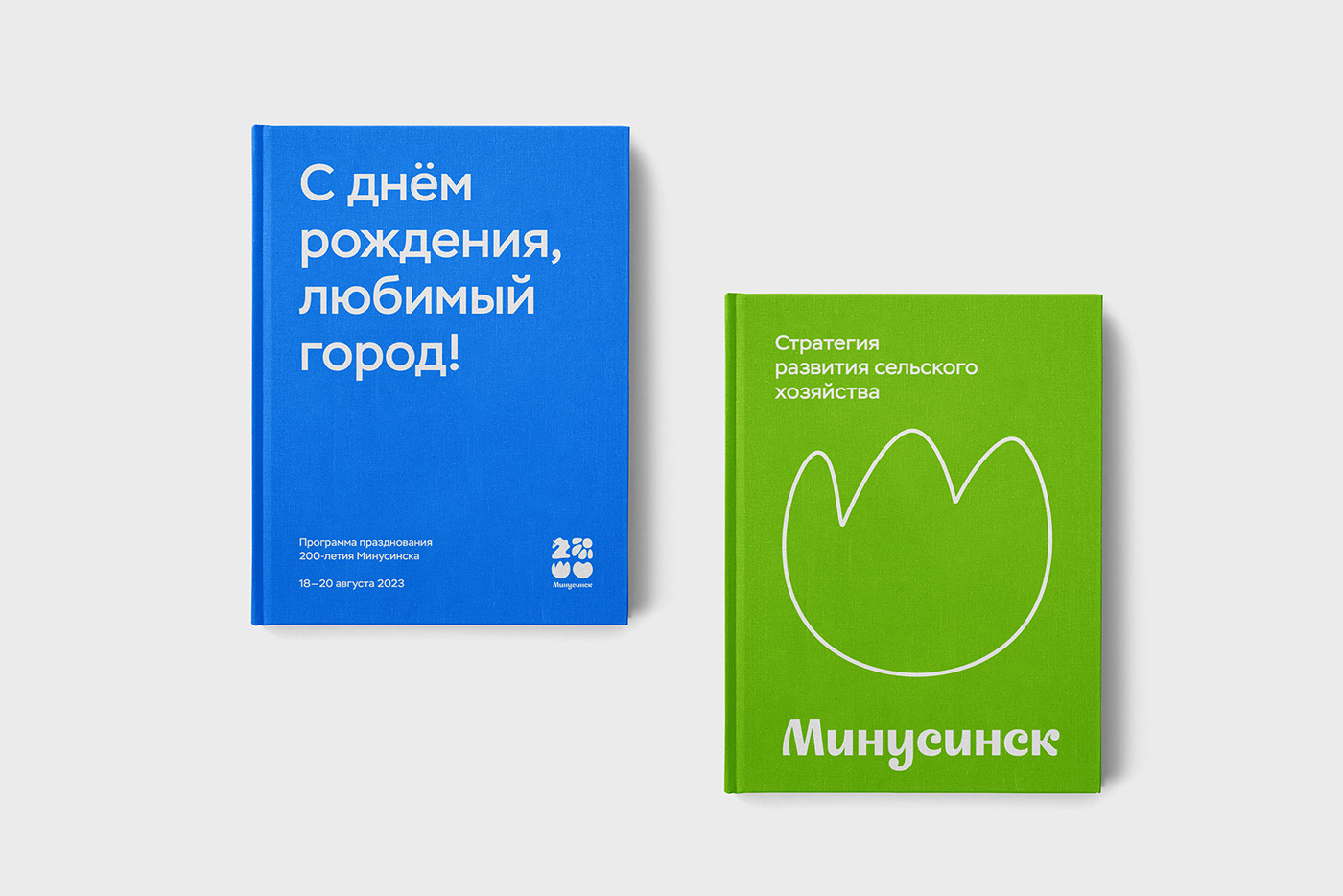
Главные символы города отобразились в новой айдентике: конь — образ из герба, помидор — общепринятый и узнаваемый символ Минусинска, росток — олицетворение сибирского садоводства, солнце — уникальное расположение и комфортный климат.
The main symbols of the city are reflected in the new identity: the horse is an image from the coat of arms, the tomato is a generally accepted and recognizable symbol of Minusinsk, the sprout is the personification of Siberian gardening, the sun is a unique location and comfortable climate.
У города, как и у любого бренда, есть свои задачи, в том числе коммуникация с жителями. Мы предложили яркую цветовую палитру для разных каналов коммуникаций, которая отражает позиционирование и характер территории.
The city, like any brand, has its own tasks, including communication with residents. We have proposed a bright color palette for different communication channels, which reflects the positioning and character of the territory.
Паттерн — отличный инструмент для туристической инфраструктуры. С его помощью можно оформлять мероприятия и использовать в сувенирной продукции.
The pattern is an excellent tool for tourism infrastructure. With its help you can design events and use them in souvenir products.


Из любого путешествия хочется привезти что-то с собой, оставить воспоминания в физическом воплощении. Универсальный стикерпак может реализовываться в значках, наклейках и другой сувенирной продукции.
From any trip you want to bring something with you, leave memories in physical embodiment. A universal sticker pack can be sold in badges, stickers and other souvenir products.


В рекламных коммуникациях мы отразили праздничную обстановку и рассказали историю Минусинска современным визуальным языком. Главное, на чем мы сосредоточились в процессе разработки — стиль не должен стать единовременным. В перспективе его можно и нужно использовать для развития туристического потенциала.
In advertising communications, we reflected the festive atmosphere and told the history of Minusinsk in modern visual language. The main thing we focused on during the development process is that style should not become a one-time thing. In the future, it can and should be used to develop tourism potential.


Новый стиль хорошо адаптируется в онлайн-среду.
The new style adapts well to the online environment.
Арт-директор – Максим Кулдошин
Дизайнер – Мария Никашина
Шрифтовик – Татьяна Черкиз
3D-дизайнер – Евгений Усков
Визуализатор – Наталья Колесова
Фото – Сергей Филинин
Продюсер – Александр Осадчий
Бренд-стратег – Данила Юсьма
Art director – Maxim Kuldoshin
Designer – Maria Nikashina
Type designer – Tatyana Cherkiz
3D designer – Evgeniy Uskov
Visualizer – Natalya Kolesova
Photo – Sergey Filinin
Producer – Alexander Osadchiy
Brand strategist – Danila Yusma
Type designer – Tatyana Cherkiz
3D designer – Evgeniy Uskov
Visualizer – Natalya Kolesova
Photo – Sergey Filinin
Producer – Alexander Osadchiy
Brand strategist – Danila Yusma


